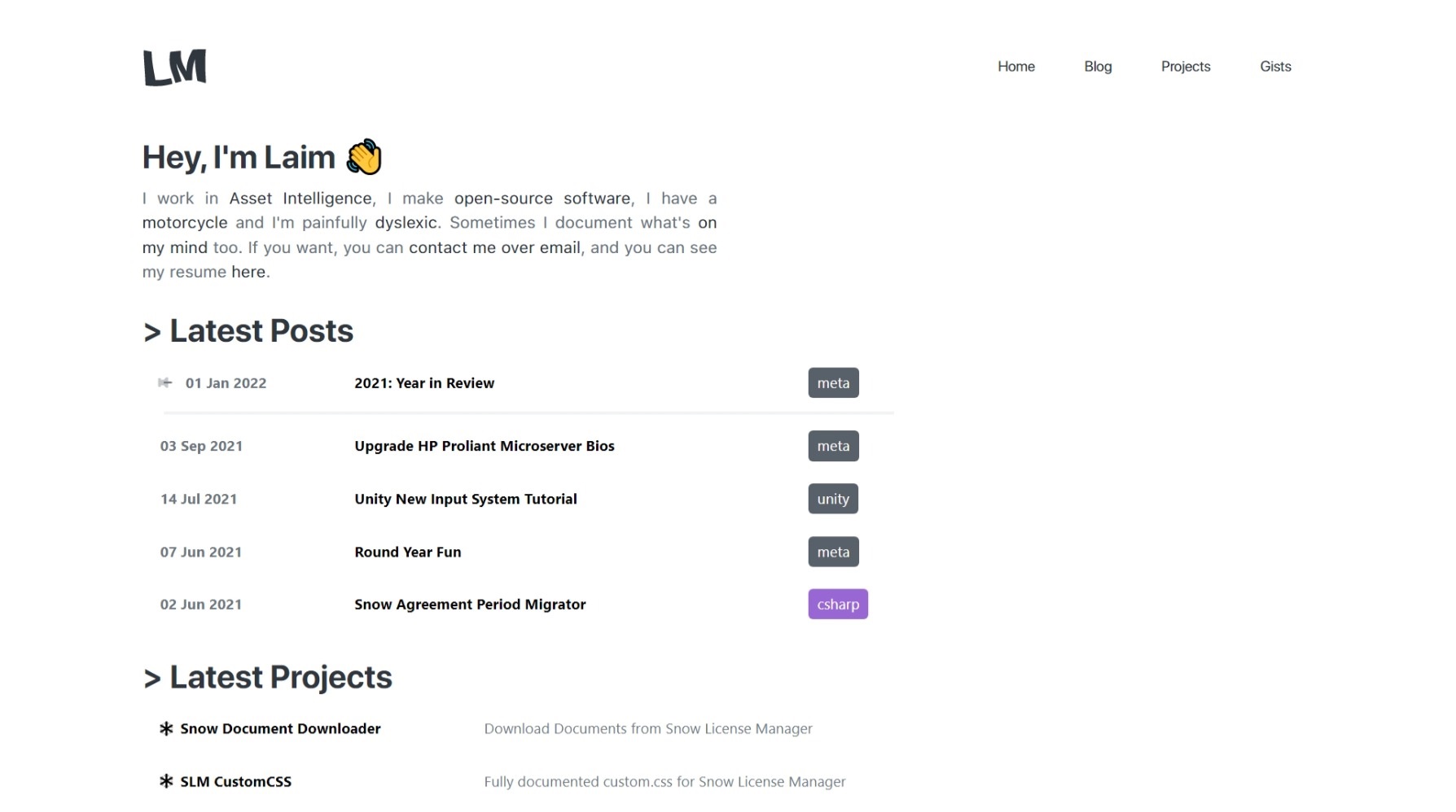
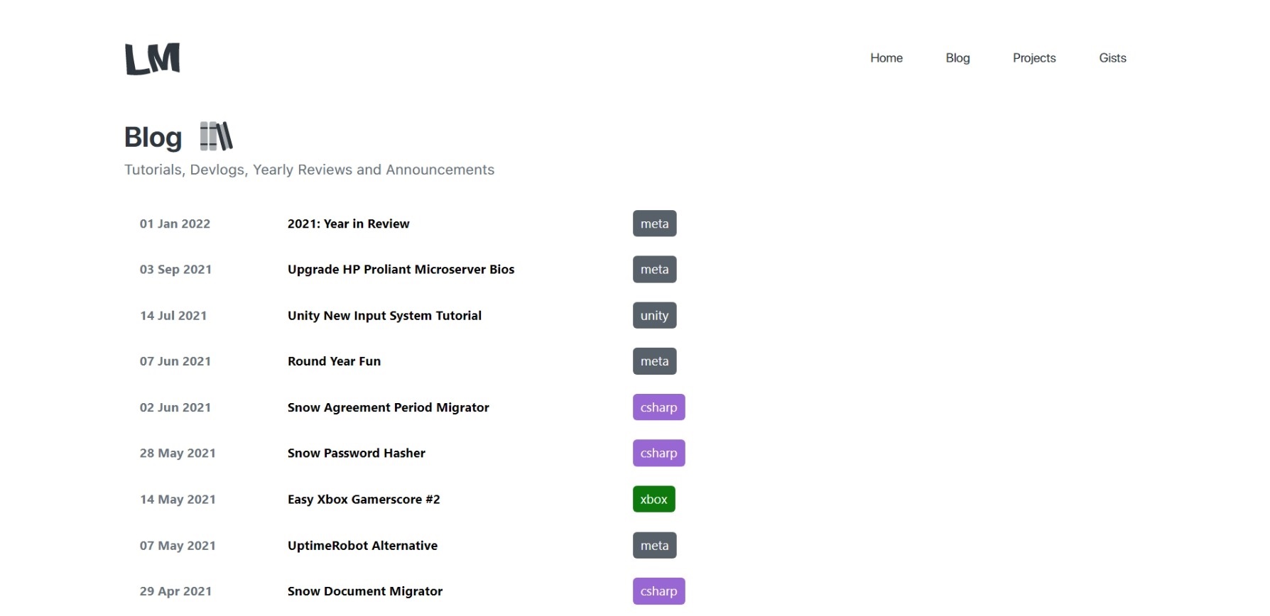
I ended up removing this from my 2021: Year in Review because I was undecided at the time if I was going to do it. Originally when I created v1.0 of this website I was using Jekyll, before that I was using a custom CMS because I didn’t like the ones that were available online, specifically WordPress. I explained this a bit in my original migration to Jekyll.

Here’s the thing though, it was the first time I’d ever used Jekyll. A lot, and I mean a lot, of things weren’t done properly and most of the site was stuck together with duck tape in the hopes that next time there was a GitHub Pages build it wouldn’t break, it was a disaster and I posted barely any content near the end of 2021 because it was starting to be a bit of a pain doing anything, including even building a new post because GitHub Pages would just crap its pants because of how badly put together it was.

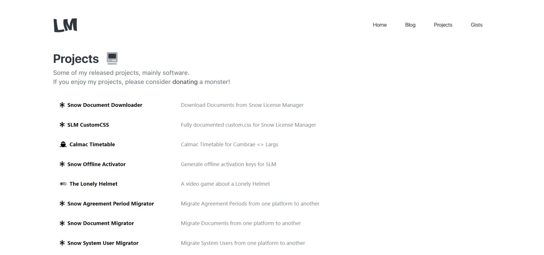
I originally loved the design but as time went on I started to hate it, the lack of dark mode I know bugged a few people along with the amount of empty space on the right since everything was aligned on the left, it just wasn’t very good - it wasn’t bad, just not very good. The only exception to that is the projects page, it was a disaster and one of the biggest reasons I decided to re-do the entire thing - it was hot garbage.

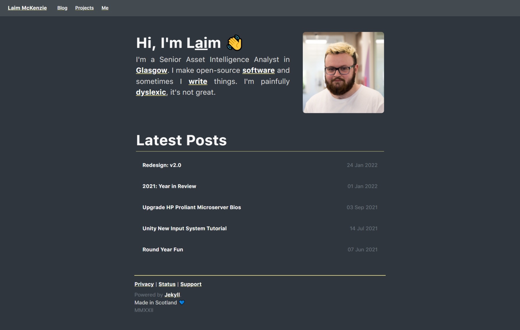
So here’s to Version 2.0, there were 767 commits to v1.0 - mostly post updates and me trying to fix things that somehow broke so, hopefully v2.0 does better. Here is some of the more important changes:
- Light and Dark Mode based on System Settings
- Better in-depth Projects page
- Blog is now organized by Year
- Post Categorization - Example
- Full-width Navigation
- More minimized feel
- An actual about me page

Hope you enjoy it, hope it’s easier on your eyes. 😄
Now Playing: DIAGONAL - Killstation